Is there any monospaced font with Greek where the diacritics are distinctly legible around 10 points? I'm now using DejaVu Sans Mono, but to be sure, especially about spiritus, I have to increase the font size.
3 Answers
I tested a few out. The spiritus in DejaVu Sans Moto looks actually fine to me at 12 pt, the older standard font size.
I wonder if it's a platform issue rather than a font issue?
Either way, some other monospace fonts I found that had legible Greek diacritics:
Blender Mono I18N: https://postimg.cc/1nRJkVxD
LM Mono: https://postimg.cc/bSsLJXwJ
Source Code Pro: https://postimg.cc/R6PX4C9y
These are all screenshots I took on my computer. For showcasing the letters, I used LibreOffice on Fedora Linux at 12pt font size. At ten point, you're going to have a hard time with any font. Still, I could make them out clearly at about 1 foot away. The only other real options are to make the font bigger or get closer. If you're on a phone, I believe most have a magnifying glass app that can help read it.
-
For me (nearsighted), looking at these screenshots at default size, the spiritus tend to blur into an indistinct blob—it's easy to see that there's a spiritus there, but I have to get in closer to tell if it's rough or smooth.– Draconis ♦Commented Jan 30, 2021 at 23:41
-
@Draconis They're legible to me, though I do have to look a little carefully when it has both a spiritus and an accent. If you can't really tell, I'm afraid the only real option is making the font bigger or getting closer to the screen.– cmw ♦Commented Jan 31, 2021 at 0:02
-
@Draconis Just to be sure, though, you're looking at them on your computer or your phone?– cmw ♦Commented Jan 31, 2021 at 0:02
-
Laptop with HD screen at 200% magnification. But this really shouldn't be an intractible problem; the acute, circumflex, and grave, for example, are all clearly distinguishable at this size. It's just the design of the spiritus (heavy body, light tail) that poses a problem, so it should be possible to design a font to make them easier to distinguish. The question's just whether anyone's already done so.– Draconis ♦Commented Jan 31, 2021 at 0:10
On optical size
I’ll add this as an answer, as it might be helpful in guiding your future searches for good fonts. For recommendations, I do not have anything to offer which has not already been mentioned by @C.M.Weimer. However, this is an issue which may be solved more easily with some typographical insight.
What you should look for, is a font with more than one optical size. Many – if not most – fonts found online, are designed from only one optical size, then resized by the computer to whichever font size is necessary. This is unfortunate, and does not reflect what typecasters learned over the centuries of font development since Gutenberg – and, to wit, before him as well in all the illuminated volumes.
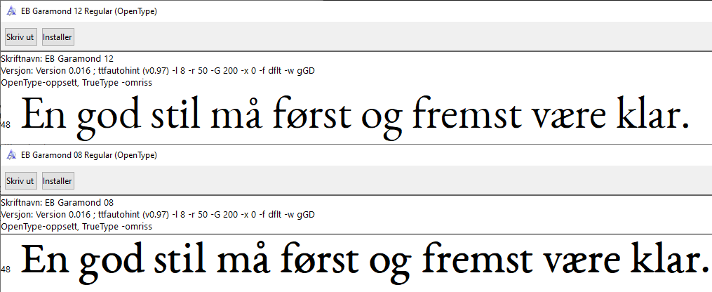
It is quite common for a good typeface to be delivered in for example 8 pt and 12 pt optical sizes. Take a look at the below example:
The upper font sample is in what in Germanic countries are known as Cicero size: 12 point size; it is based on a font size cast at 12 points, and is a good choice for text which is meant to be body text. The lower sample is cast at the so-called Petit size: 8 points. This means it is a good font size for example for foot notes. Notice how it is wider, has a slightly modified shape, and appears to be quite bold; in fact it is not. Rather, it is meant to be displayed at a smaller size, and to appear to have the same font weight as the 12‑point size, it has to be wider and fatter to appear to be of the same weight. Here are a couple of letters stacked on top of each other; red is 8‑point and black is 12‑point optical size:
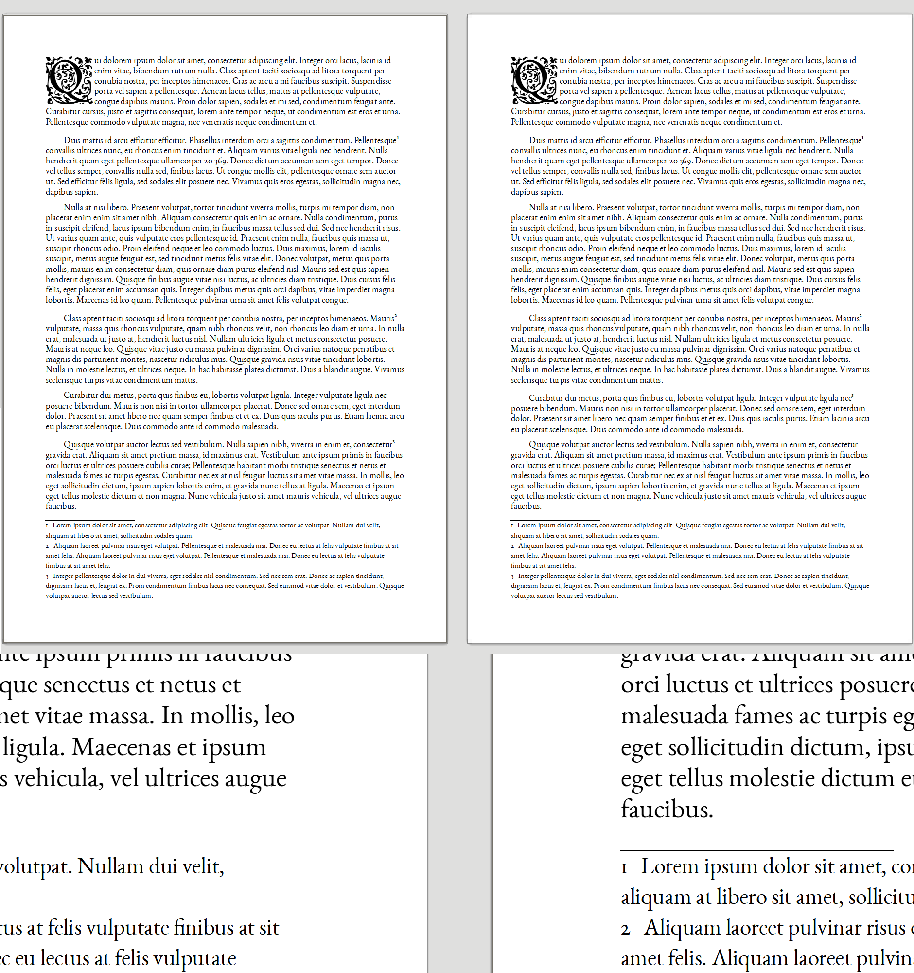
Both text samples are rendered at the same size, but the 8‑point optical size has slightly wider serifs, slightly wider downstrokes, and in this case is in fact a bit shorter. Here is an example of two pages side by side, the left where all text is rendered in 12‑point optical size, the right with footnotes rendered in 8‑point optical size, whilst the body text is rendered in 12‑point optical size.
Notice how the footnotes on the left-hand side appear to be more slender and how their weight appears obviously lighter than the body text; this is because it is the wrong font weight for that text size. On the right hand size, the footnotes appear to be more or less of the same level of ‘blackness’ on the page as the body text; this is because it is rendered in the 8‑point optical size, which is designed for text that small.
In conclusion
What you need to look for to find a font which has good legibility at lower size, is a font which is specified to include more than one optical size. Good fonts will have at least two optical sizes, usually one for footnotes (which would be roughly the size you are looking for) and one for body text. Excellent fonts will include an optical size for headings as well, but heading fonts can often be supplied as a separate font file.
I hope this will make it easier for you to find what you are looking for. Should there be any more information which may be of help, please let me know in the comments.
A possible solution that I'm employing while learning myself as well as teaching others is to stop using the smooth breathing at all.
EDIT: Hey there;) So to respond to your questions in comments:
I don't know of any materials that would use this convention so far, but I plan to change that. Personally I know a few people, that have adopted it, and I wasn't even the first. One of the teachers at AVN (with very good mastery of AG) uses it, likewise I also met some academic from Britain doing the same (can't give the specifics, as I think I should ask for permission first, since they don't publish on their own so far, and so it is not a widely known fact).
Just as you assumed, Joonas, smooth breathing is recognized by the absence of a breathing mark. Since that with utmost probability it wasn't pronounced in any way, there's no point in preserving it, and if it proves otherwise sometime in the future - we can adopt.
I've used the convention in all the materials I'm preparing for my students, and the main reason is that I noticed on quite a large scale (100+ people), that it at most confuses students, if anything, especially at the beginning, when there are more important aspects of the language and its alphabet to draw their attention.
As for the technique - for every text, that I have available in editable format I just apply a few letter swaps before proceeding to read it or use it in class.
-
2Welcome to the site! Do you mean that you only mark rough breathing and recognize smoothness by absence of a breathing mark? This sounds like a non-standard approach. Is this method followed by any textbooks or other material? You can edit your answer to add details.– Joonas Ilmavirta ♦Commented Feb 2, 2021 at 21:44
-
2As with @JoonasIlmavirta, I am interested in hearing more on this. Your answer could prove to be useful – and I would then happily upvote it – if you would provide us with some references to your method, or be that you have none, a more thorough explanation of how and why you choose to do this. (Now, why on earth is there one O in prove and two in choose? English spelling rules …‽) Commented Feb 3, 2021 at 8:56
-
1
-
1Thanks, @Marblescraps, for the update. I do, of course, see one good reason for including smooth breathing, which anyone with database experience would attest to: It’s a fail safe. If an indication of spiritus is missing, how do you know for sure it is supposed to be smooth breathing or that the rough breathing went missing? It is indeed good practice to include it. However (!), I completely agree with you from a pedagogical perspective. There really is more than enough to try to understand when learning Greek (I’m a beginner learner now myself), so it clearly is didactically sound. Commented Feb 6, 2021 at 0:07
-
I must disagree with the argument you've provided, @CannedMan, as I feel that it is equally plausible to just type the wrong breathing mark by mistake, all the more so for a beginning learner, as it is to omit putting the rough one where it belongs, and so there's no advantage whatsoever in typing the smooth breathing mark considering all the other negative consequences I've listed. Commented Feb 7, 2021 at 20:09


