9

There are quite a lot of fonts available for writing Latin, which have been designed for easy legibility and contain all the letters of the Latin alphabet.

For the Greek alphabet, however, most modern fonts are designed for modern (monotonic) Greek, and thus aren't designed to make (e.g.) ἔ and ἕ easily distinguishable. Most of the time, I need to zoom in quite far to see the distinction between those two, which is annoying while reading or translating.

So, what are some popular fonts designed specifically for polytonic Greek? My eyes would appreciate anything with easier-to-read breathing marks.

2
  • Related: latin.stackexchange.com/q/10987/406 (though that question is looking specifically for monospaced fonts, and I'm looking for anything that's easy to read on a screen).
    – Draconis
    Commented Jul 10, 2020 at 23:13
  • 1
    Out of morbid curiosity: the stylesheet of Wikipedia, as long as the text is marked as polytonic Greek, will attempt to use 'SBL BibLit' font first. Commented May 27, 2022 at 12:03

1 Answer 1

9

I've long relied on the free Gentium typeface, which has a simply gorgeous, highly readable polytonic Greek font, with diacriticals that I've always found quite easy to distinguish, both on the printed page and on the computer screen. I used to have a custom stylesheet to display all Greek text on the Perseus website in Gentium, because it's much easier on my eyes.

You should also check out the site of the Greek Font Society, which offers some very fine recreations/digitizations of historically significant polytonic Greek fonts, also available for free download. Some of GFS's faces don't even have Latin fonts; their focus really is on high-quality Greek typography, though some of the faces are more appropriate than others for regular running text. The diacriticals in the GFS Didot Classic face, in particular, are extremely pronounced and clear – almost too clear, if that's possible. Their GFS Heraklit face, after an original by Hermann Zapf, is also very nice, with quite distinct diacriticals.


Update: As requested, here are examples of the 3 faces that I mentioned (plus a fourth, GFS Porson). In the document that I captured the image from, the text for all 4 examples was set at 11 points with line spacing set at 14 points.
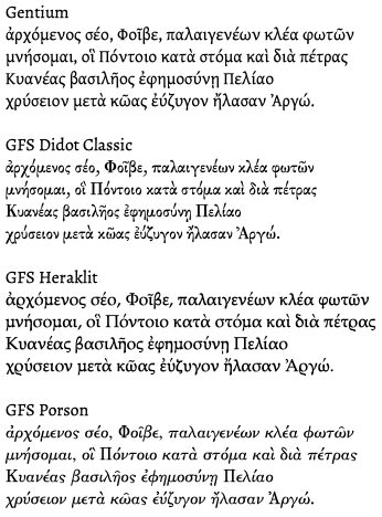
Opening lines of the Argonautica in 4 Greek fonts

3
  • 1
    The clarity of Didot with its low x-height, is unmatched by the others. Maybe that is a key thing to look for? Fonts with a lower x-height? A low x-height allows more room for the diacritics to breathe, so to speak.
    – Canned Man
    Commented Dec 7, 2022 at 12:51
  • 2
    @CannedMan, The x-height certainly has something to do with it, as does the somewhat exaggerated size of the diacriticals. Over all, what makes the Didot such an effective face is that the letters have been designed so that each is so utterly unique. Even at a distance a sigma and an alpha are distinct. I greatly admire Zapf, but because the counters of the rho, omicron, sigma, and even the alpha, are basically the same, the letters can lose distinctiveness at even a bit of distance. The only issue I have with the Didot face is that the letter spacing always feels a litte cramped to me.
    – cnread
    Commented Dec 10, 2022 at 2:11
  • That is a very informative comment (I would advise adding much of that to your answer). Does Didot come in both display and text optical sizes? Also, I can agree that your sample does indeed look a bit cramped (and it is a bad font selection for printing on low-quality paper; I would expect a lot of bleeding, especially with e.g. ντ, ε, νε, possibly ημ), but there are two options to solve this: If not writing an academic text with strict restrictions, one could strongly argue for simply increasing font size; if restrictions are strict, another option would be to slightly increase kerning.
    – Canned Man
    Commented Dec 10, 2022 at 23:31

Your Answer

By clicking “Post Your Answer”, you agree to our terms of service and acknowledge you have read our privacy policy.

Not the answer you're looking for? Browse other questions tagged or ask your own question.